Logo DesignFollowing are logos designed and produced by Active Lightning. Smith Farm Stores LogoSmith Farm Stores wanted to pursue a strong ecommerce presence for workwear, outerwear, and footwear. In addition to this product focus, they still wanted to be able to sell other products online such as toys, animal health supply products, Holland Grills, United States Stove Company products, and Koenders Windmills. We determined that in addition to their primary logo (used throughout their physical store, signage, and trucks), they would have a related derivative logo that demonstrated their commitment and focus to the workwear, outerwear, and footwear products. The client's target market includes people who work outside, who have pets and who live on farms. They wanted something that was friendly. They wanted to broaden their image beyond farm-related products while letting people know that their products were built to last. The company identity was described as: professionalism with respect to business management but informal and friendly with respect to customer service. They have an emphasis on relationship and satisfaction. Evidently in Indiana, diamond-plate steel is a common surface associated with ruggedness. So "Smith" is punched out like "Ford-tough" and the diamond-plate steel echoes the ruggedness. In the second logo, we clothe the arms with a Carhartt jacket. The green accents in the gloves infer the green of outdoors. Stoughton-Lumber Logo
Their company identity was described to us as:
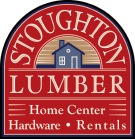
Logo Development Process for Stoughton LumberThe process for developing the logo for Stoughton Lumber started with a meeting to capture aesthetic and business values from the owner who we worked with on the project, Jim Gerber. The designer on the project was Baker Galloway. So, Jim, Baker, and Sally, met via phone. Out of discussions between Sally and Baker, Baker developed sketches for 3 logo designs. Jim approved the direction, so black and white images were drawn digitally and posted to a webpage where Jim could view them. Click here to see the logo options in black and white Jim picked this one:
Then Baker developed color options. Click here to see the color options for Stoughton logo design From this, Jim chose this one:
The logo has been very well received and features prominently in the Stoughton Lumber website. A-1 Appliance Parts Logo
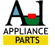
The logo has a bright open feel which appears to be very distinctive in the appliance parts marketplace. Also, “bright” and “open” are characteristics that reinforce the great customer support that A-1 offers from the sunny state of Alabama. The logo provides an abstract reference to “parts” by coloring parts of the (whole) name that is rendered in a distictive typeface. Cox Hardware and Lumber LogoWe like the fact that the gray border and letters abstractly refer to metal hardware; the woodgrain fill for the Texas shape refers to lumber. This logo is a redesign of an original idea conceived by the owner. It conveys Texas pride, western sentiment, while being professional.
|
|
CONTACT: 617.275.4413 | Sales@ActiveLightning.com
Copyright © 2001-2007 Active Lightning.